I have learned—again and again—that children are some of the most attentive researchers I know. They notice things adults have forgotten how to see. They linger where we rush. They ask questions we overlook. And lately, as our classroom’s ongoing inquiry into color continues to evolve, the children have reminded me of something deceptively simple: color changes depending on where it lives.
This realization didn’t happen all at once. In earlier chapters of this journey, we explored natural inks and watched pigments swirl with imperfections that only nature can offer. We revisited color theory through hands-on mixing, then expanded our palette by playing with color and light on the overhead projector. Most recently, we stripped color away altogether and looked at the power of black, white, and shadow. Each of those explorations felt like a step deeper into the world of perception—how children see, think, and construct knowledge.
But this week, the children led me into an unexpected return: back to color, yes, but through a new lens. Not the pigments themselves this time… but the backgrounds that hold them.
The Day We Returned to Color
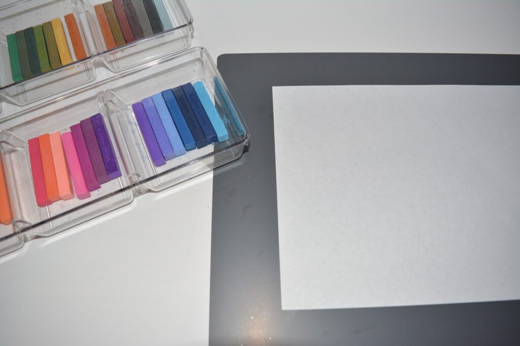
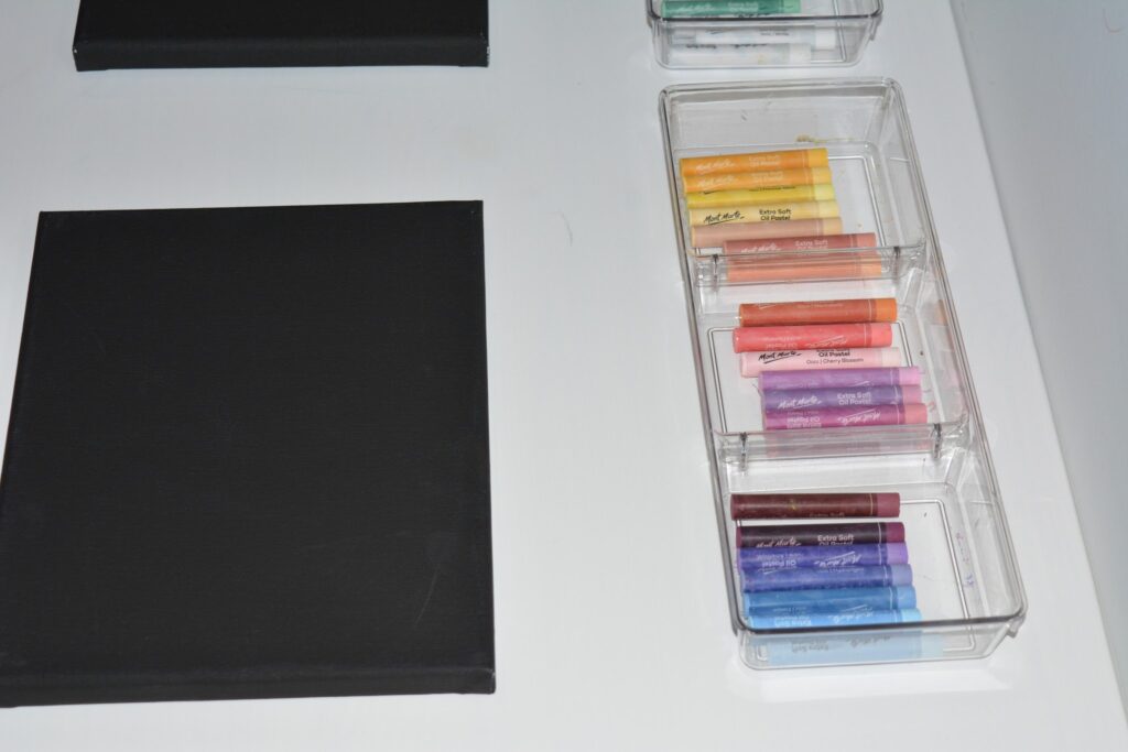
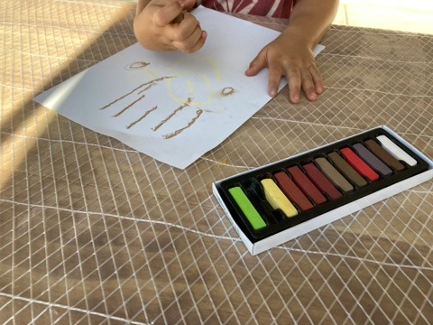
It began with a simple invitation. I placed two sets of papers on the table: one stack bright white, the other deep matte black. In the center, I arranged trays of chalk pastels, some bold and saturated, others soft and dusty, each one familiar to the children. Nothing new. Nothing flashy. Just an intentional contrast.
The children noticed immediately.
“Why is the black paper so dark?” one child asked, running her fingers across the surface as though she might uncover light beneath the darkness.
“It looks like night,” another exclaimed.
I didn’t give them directions. I didn’t instruct them to compare. I simply watched as they made choices with confidence and curiosity. Some gravitated to the clean brightness of the white paper. Others were drawn irresistibly to the velvety mystery of the black. A few set up their own side-by-side experiments.
And then the discoveries began.
Colors That Glow, Colors That Sink
One of the most beautiful aspects of chalks and oil pastels is their immediacy. Color doesn’t need time to develop or spread, as can occur with watercolor or colored pencils. It appears with the slightest pressure, and the children quickly saw how dramatically the background influenced each stroke.
On white paper, chalk pastels took on a soft, airy presence. Blues and greens smudged into delicate gradients. Pinks and yellows blended easily. The children described these colors as “smooth,” “light,” and “easy.”
But on black paper?
Everything transformed.
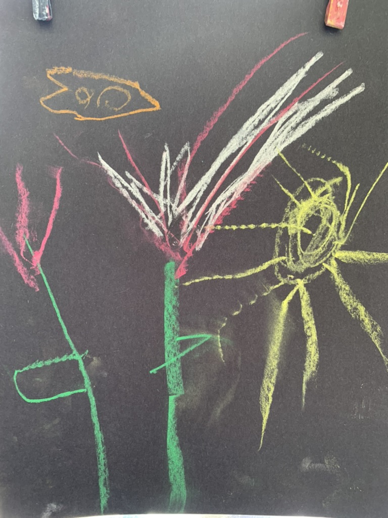
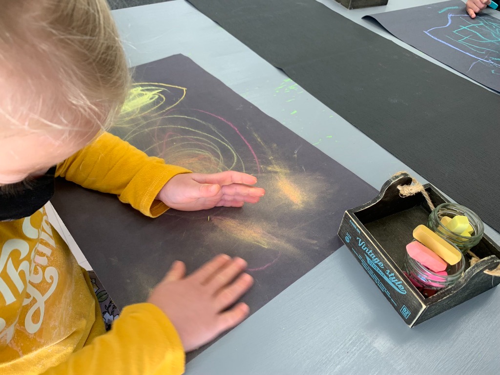
The pastels became luminous. Yellow left a bold, electric streak that seemed almost lit from within. Magenta turned deeper, richer, more dramatic. Blue, when dragged lightly across the black, had a shimmering intensity the children had never seen before.
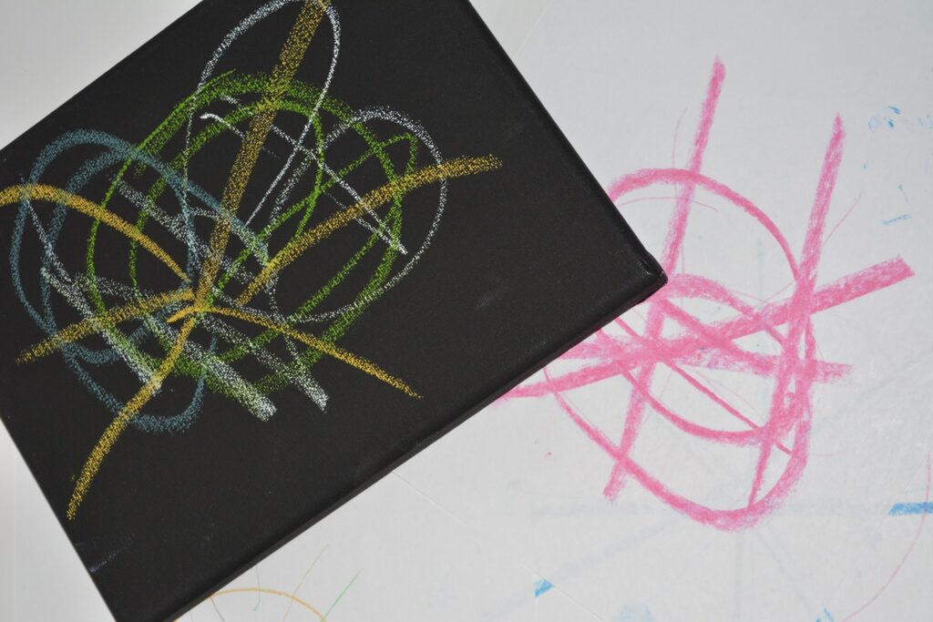
One child compared the same stroke across both surfaces—first on white, then on black—and stared for a long moment.
“It’s the same color,” he finally said, “but also different… like it changes its mind.”
Yes. Exactly.
Another child layered turquoise chalk over black paper and gasped. “It looks like big wind!” she said. The same turquoise on white had looked powdery and soft, but on black it felt powerful.
It struck me how rarely we invite children to explore contrast in this intentional way. Chalks and pastels show their true personalities on dark backgrounds, but we often offer them only on white. This shift opened doors—not just visually, but cognitively and emotionally.
Finding Colors: Slowing Down the Seeing
What happened next reminded me why these revisiting journeys matter.
The children slowed down.
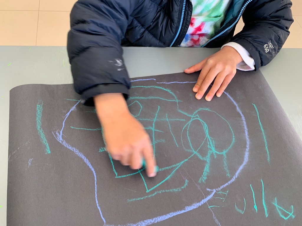
Not because I encouraged them to, but because the materials required it. Chalk and oil pastels behave differently. They blend differently. They sit on the surface differently. And the paper beneath them changed every stroke.
The children became observers—real researchers of color investigating their own questions and theories.
“Why does the yellow look so bright on this paper?”
“Why is the red darker here?”
“What makes the blue glow?”
These weren’t scripted questions. They were born from experience, from looking closely, from being invited to linger instead of rush.
It brought to mind a favorite quote from artist Josef Albers: “In visual perception, a color is almost never seen as it really is.”
This is exactly what the children were discovering: color is not absolute. It is relational. It is shaped by what surrounds it—light, darkness, surface, texture.
In a world that often values quick products over slow processes, it felt powerful to give children permission—no, space—to truly see.
What Happens When We Give Children Space
As the children layered chalks and pastels onto both white and black paper, something unexpected surfaced. They began talking about feelings—not just colors.
“White feels soft,” one said.
“Black feels strong,” another responded.
“It’s like white is daytime with the sun and black is nighttime when I sleep,” someone else remarked, “and the colors are different in each.”
The children weren’t just analyzing. They were connecting. Interpreting. Making meaning. Their experiences were emotional as much as visual.
This is the heart of revisiting journeys. We return—not to repeat, but to deepen. To look again. To discover what we missed the first time.
The children were learning that color is not simply pigment. It is experience. Relationship. Context.
And perhaps most importantly, they were learning to notice.
The Call to Action: Slow Down, Look Again
If there is any message I carry forward from this exploration, it is this:
Slow down.
Children need time to test a chalk mark on white paper and then test that same mark on black. They need space to blend colors gently and see how the background absorbs or reflects each stroke. They need quiet moments to pause and notice why an oil pastel looks neon on black but muted on white.
These discoveries do not come from rushing. They come from space. Time. Intentionality.
So my call to action is simple:
Let children linger.
Let them compare.
Let them return to colors they think they already know and see them in new ways. Provide both black and white backgrounds and give children the unhurried time to study the vibrancy of each hue, tone, and shade. Slow the process down so the seeing can deepen.
When we do, we gift children not just knowledge—but attention, wonder, and the joy of discovering the world again and again.
Read More
Order the Book